25—07 / Travel
Laying the foundations for DerTour in the UK.
DerTour is one of Europe's largest travel names, part of the DER Touristik Group. Bringing it to the UK meant building the brand from the ground up: the strategy underneath it, an identity that could carry a big name, a design system real teams could run, and a rollout built to survive contact with them.
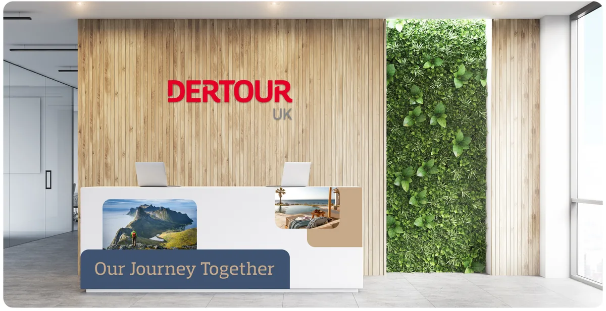
Foundations before logos
The temptation with a new market is to jump straight to a logo. We started a layer down, with what DerTour stands for in a crowded UK travel market and how it should sound and behave before it looks like anything at all.
Get that right and every later decision has something to answer to. Skip it and you spend the next two years arguing about shades of red.
An identity built to scale
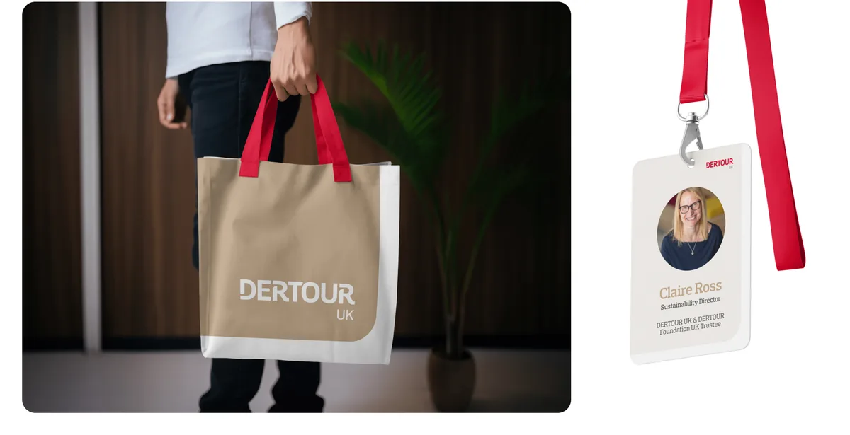
A travel brand has to work across a lot of surfaces at once: brochure, booking flow, campaign, retail, the small print. We built a visual system flexible enough to hold all of it without coming apart, and distinctive enough to be recognised in a category that mostly looks the same.
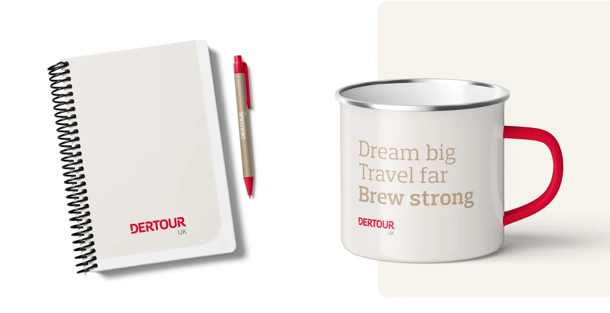
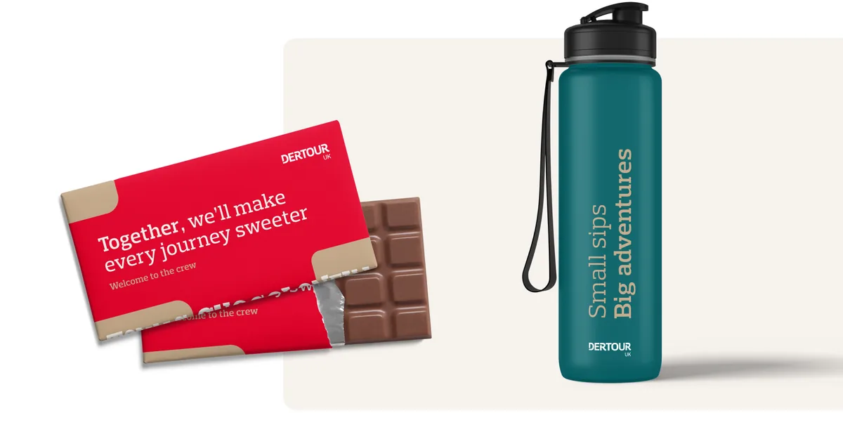
The tone matters as much as the marks. "Our Journey Together", "Dream big, travel far", "Welcome to the crew": a voice that sounds like people, not a tour operator's terms and conditions.
A design system, not a style guide
A PDF of rules gets ignored the first time someone's in a hurry. We delivered a working design system: components, tokens and patterns teams could actually build with, so the brand stays itself in hands that were never in the room.
A rollout that holds
Rebrands are judged on the launch and decided in the eighteen months afterwards, when hundreds of people apply the thing to work nobody anticipated. We planned the rollout for that reality, from the front desk to the freebies, not for the launch photo.
Something similar in mind?
Tell us what you're trying to change. If we're the right studio for it we'll say so, and if we're not we'll tell you that too.